Oct 18, 2025


Insight into reality – not into the model
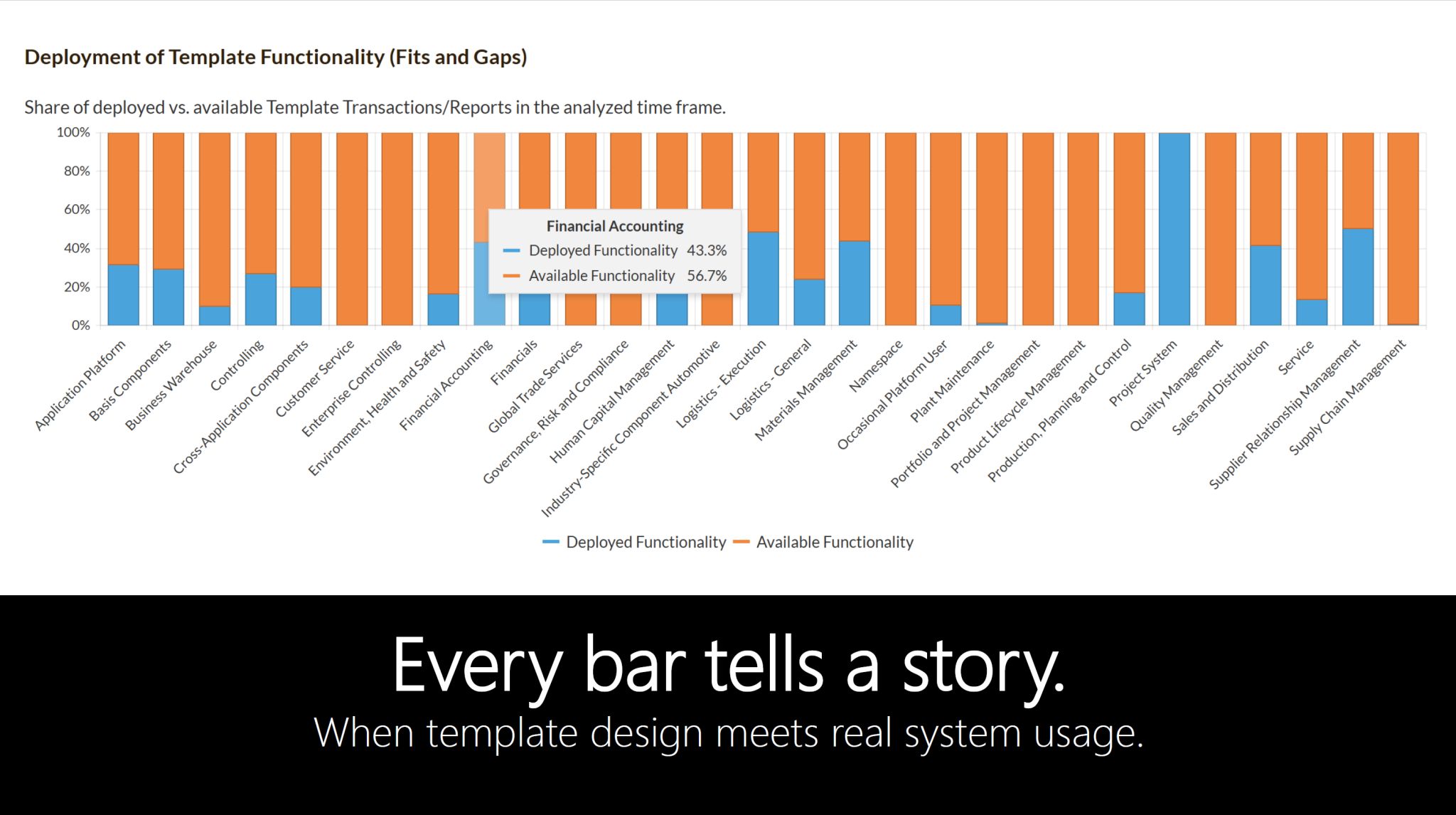
What you see here is not a mockup.
It is a real fit-to-template analysis from the KPI Analyzer,
focused on financial accounting.
What the graphic shows:
🟦 Blue bars: Used functions in the system
🟧 Orange bars: Available but unused template functionality
In just one screen, it becomes clear:
➡️ Which parts of the template are actually used
➡️ Where functions are lying dormant
➡️ And where standardization potentials are hidden
The moment of truth
For many teams, this is the point,
where template design meets real system usage.
From here, discussions change –
shifting from assumptions to data-based clarity.
For understanding usage is not a detail.
It is the foundation for every Clean Core, RISE-
and public cloud strategy.